노마드코더 강의를 보고 ApexCharts.js를 정리하는 글입니다.
ApexCharts.js - Open Source JavaScript Charts for your website
ApexCharts is a a free and open-source modern charting library that helps developers to create beautiful and interactive visualizations for web pages.
apexcharts.com
import ApexChart from 'react-apexcharts';일단 react-apexcharts 라이브러리를 import합니다.
<ApexChart
  type="line"
/>
차트의 타입으로는 line, area, column, bar, mixed, timeline, candlestick, boxplot, bubble, scatter, heatmap, treemap, pie, radialbar, radar, polar area, dashboards가 있습니다.
데이터의 종류에 따라 적재적소에 타입을 설정하면 될 것 같습니다.
<ApexChart
  type="line",
  series: [{
  name: "Desktops",
  data: [10, 41, 35, 51, 49, 62, 69, 91, 148]
}],
/>
다음으로 시리즈입니다. 이 부분에 데이터를 넣어주면 됩니다. 데이터는 위의 형식과 같이 배열로 넣어주면 됩니다.
name은 해당 데이터의 key 역할을 하게 됩니다.
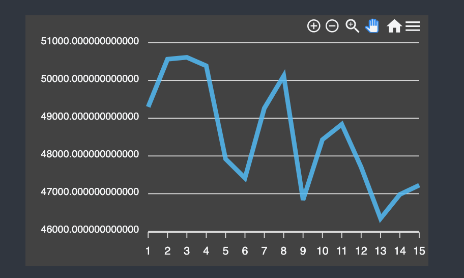
여기까지 했을 때의 차트입니다. 예쁘게 보이진 않습니다.

options props에 다양한 option을 넣을 수 있습니다. option을 추가해서 차트를 좀 더 예쁘게 만들어 봅시다.
<ApexChart
  ...
  options={{
    theme: {
      mode: 'dark',
    },
  }}
/>
theme: https://apexcharts.com/docs/options/theme/
mode뿐만 아니라 palette를 지정해주면 라이브러리 측에서 지정해준 색조합을 사용할 수 있습니다.
디자인에 약한 저로서는 이 기능이 너무 감사하네요.
저는 다크모드만 적용했습니다.


options={{
  colors: ['#0fbcf9'],
}}
colors: https://apexcharts.com/docs/options/colors/
색상을 지정해주는 옵션입니다.
series의 개수만큼 color를 지정해주면, 각각의 선 색을 지정해줄 수 있습니다.
다크모드에서 녹색이었던 선 색을 파란색으로 수정했습니다.
그리고 공식문서에서 분기처리해서 색상 지정도 해줄 수 있었습니다.
colors: [function({ value, seriesIndex, w }) {
  if (value < 55) {
      return '#7E36AF'
  } else {
      return '#D9534F'
  }
}, function({ value, seriesIndex, w }) {
  if (value < 111) {
      return '#7E36AF'
  } else {
      return '#D9534F'
  }
}]
/*   */
options={{
  chart: {
    height: 300,
    width: 500,
    toolbar: {
      show: false,
    },
    background: 'transparent',
  },
}}
chart: https://apexcharts.com/docs/options/chart/background/
options의 chart 속성은 많은 설정이 가능합니다.
위에선 height, width 지정, toolbar 표시 안하기, 투명 배경만 지정했습니다.
하지만 공식문서를 보면 엄청 많은 옵션들이 있으니 그때그때 필요할 때마다 확인해야할 것 같네요.

grid: { show: false },grid: https://apexcharts.com/docs/options/grid/
grid는 기본적으로 show default가 true로 false를 안하면 선이 보이게 됩니다.
저는 grid가 없는 편이 훨씬 차트가 보기 편한 것 같아서 false로 지정했습니다.

stroke: {
  curve: 'smooth',
  width: 2,
},
stroke: https://apexcharts.com/docs/options/stroke/
stroke는 선에 대한 옵션입니다. show 옵션도 있지만, show: false를 할 경우 선이 안보이게 됩니다.
그리고 curve에는 smooth, straight, stepline가 있고, 저는 개인적으로 smooth가 가장 보기 편했습니다.
width는 선 굵기에 대한 설정입니다. 저는 2,3이 적당해보입니다.

yaxis: {
  show: false,
},
xaxis: {
  axisBorder: { show: false },
  axisTicks: { show: false },
  labels: { show: false },
  type: 'datetime',
  categories: data?.map((price) => price.time_close),
},
yaxis: https://apexcharts.com/docs/options/yaxis/
xaxis: https://apexcharts.com/docs/options/xaxis/
x축과 y축에 대한 옵션은 엄청 다양하더랍니다...
저는 선만 보이는게 깔끔해서 x축과 y축 전부 show: false 설정을 해주었습니다.
y축은 바로 show: false를 하면 되는 반면,
x축은 바로 show 설정을 할 수 없어서 안보이게 하고 싶다면 axisBorder, axisTicks, labels 따로따로 설정해줘야 합니다.
x축의 type은 category, datetime, numeric으로 설정 가능합니다.
저는 데이터가 시간별 데이터이기에 datetime으로 type을 지정했습니다.
그리고 x축의 기준이 되는 x좌표값들을 categories에 배열 형태로 넣어주면 됩니다.
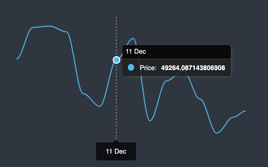
tooltip: {
  y: {
    formatter: (value) => `$${value.toFixed(2)}`,
  },
},
tooltip: https://apexcharts.com/docs/options/tooltip/
tooltip에도 많은 옵션들이 있습니다. 저는 y축 값의 소수점을 2자리까지 지정해주었습니다.

fill: {
  type: 'gradient',
  gradient: { gradientToColors: ['#0be881'], stops: [0, 100] },
},
fill: https://apexcharts.com/docs/options/fill/
fill 설정을 통해서 선에 그라디언트 효과를 줄 수 있습니다.
type으로는 solid, gradient, pattern, image가 있습니다.
각각 type별로 image: {} pattern: {} 처럼 설정을 해주면 됩니다.

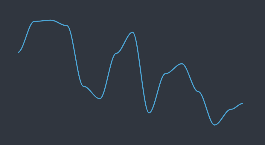
처음과 비교하면 훨씬 예뻐진 차트를 확인할 수 있습니다!


댓글